March 27, 2023
Introduction
The goal of the project is to predict lung cancer mortality rate in United States. Note that it is to predict probability of lung cancer rate in each county instead of prediction for each person. This project is not a classification but regression problem.
Datasets
- 20+ variables related to each county and lung cancer mortality rate (y variable). Total 3,134 rows.
- After data cleaning, there are 2,809 rows left.
Language and libraries
Language : Python
Libraries :
- Data Manipulation: pandas, numpy
- Data Visualization: matplotlib, seaborn, graphviz
- Statistics: statsmodels, patsy(dmatrices)
- Machine Learning: sklearn, xgboost
Data Preprocessing
Convert FIPS column to correct format
Federal Information Processing Standard or FIPS is a categorical variable. It is a code with five digits. The left two digits showing the state and the three right digits showing the county code. (e.g. 02013)
In raw data, it is numeric and not five-digits numbers. So, it is required to convert it to five digits values. (e.g. 2013 -> 02013)
Merge the population data to the main dataframe
Deal with missing value in explanatory/ dependent variable
- Remove columns with over 20% of missing values – ‘Med_Income_Black’ ‘Med_Income_Nat_Am’ ‘Med_Income_Asian’ ‘Med_Income_Hispanic’
Deal with missing value (*) in response variable (Mortality_Rate)
- Insights : Data with “*” value in the Mortality Rate column (10.37% of overall data) shows -
- only a little bit lower poverty ratio
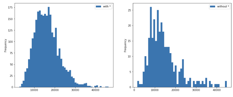
- no significant difference from the overall median income
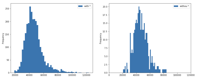
- fewer people having health insurance (and the distribution is not normal)
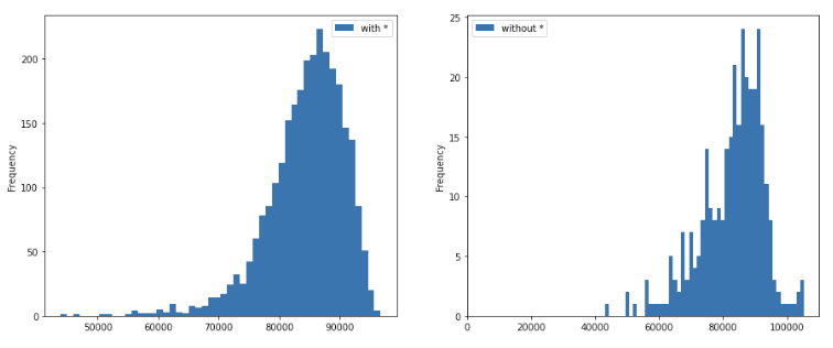
- in the columns which are not preprocessed yet such as Incidence_Rate, Avg_Ann_Incidence, Recent_Trend, Avg_Ann_Deaths, this data (* values) has 8+% of meaningless data, such as _ and __)
- only a little bit lower poverty ratio
- Final decision : remove all * values from the Mortality_Rate Column
Deal with Unexpected values and data types
- State : should be of categorical type for saving memory when the data set is large. However, because the given data set is small, it is an optional step and we are not performing data type conversion.
- Incidence_Rate : 168 non-numeric data (163 _ & __ + 5 *). After calculating the Avg_Ann_Incidence and POPESTIMATE2015 for the 5 * values, we impute the missing values for the 163 data points with the median
- Avg_Ann_Incidence : 163 non-numeirc data (_ &__). has outliers. impute with the median
- Recent_Trend : convert to categorical. However, there are some weird data input such as *, _, and __.
- Mortality_Rate : should be float. However, there are some weird data input such as *.
-
Avg_Ann_Deaths : convert to numerical
- Potential Reasons for unexpected values
- The ‘#’ values following number values in Incidence_Rate (such us “84 #”) are expected values possibly because of data collection issues.
- On the other hand, the * value in the Incidence Rate and Mortality Rate columns signifies ‘16 or fewer’ cases. This could be because in the counties with very few reported cases, a specific number could not be attributed and hence, a non-numeric placeholder was used.
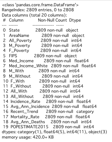
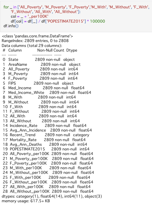
For now the summary of dataframe looks like as below.
Feature Engineering
- Convert population number to rates by population for each county Some of the numerical variables are dependent on the populations, so it would be helpful for algoritgns by converting all the raw data to per 100,000 persons rates (divide by population and multiply by 100,000).
EDA (Exploratory Data Analysis) and Feature Selection
- Visualize correlation between all features
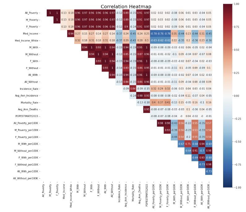
There are some features are highly correlated with each other, such as All_Poverty, M_Poverty, and F_Poverty. Removing those correlation can help reduce colinearity in linear regression models. So, I removed columns with correlation over 0.85 and kept the column having highest correlation with y variable (Mortality_Rate)
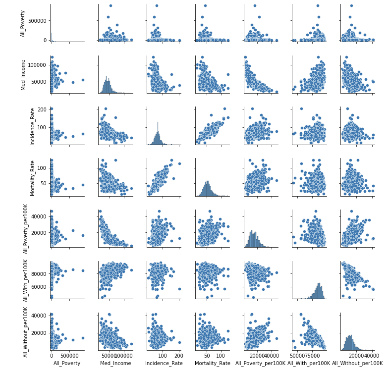
- Visualize correlation after removing high correlation (>= 0.85) & check pairplot
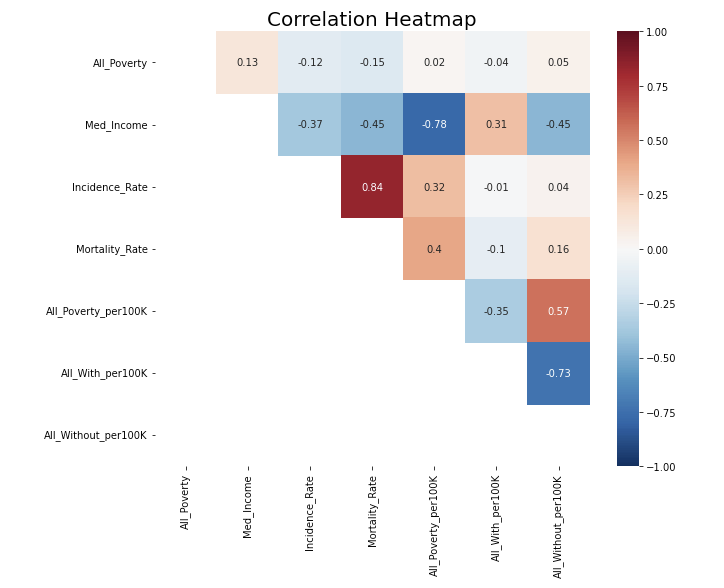
The heatmap looks good now.
However, one concern in the pairplot is that All_Poverty looks like an exponential distribution and thus transformation is needed.
- Add categorical variable Recent_Trend and draw a heatmap again
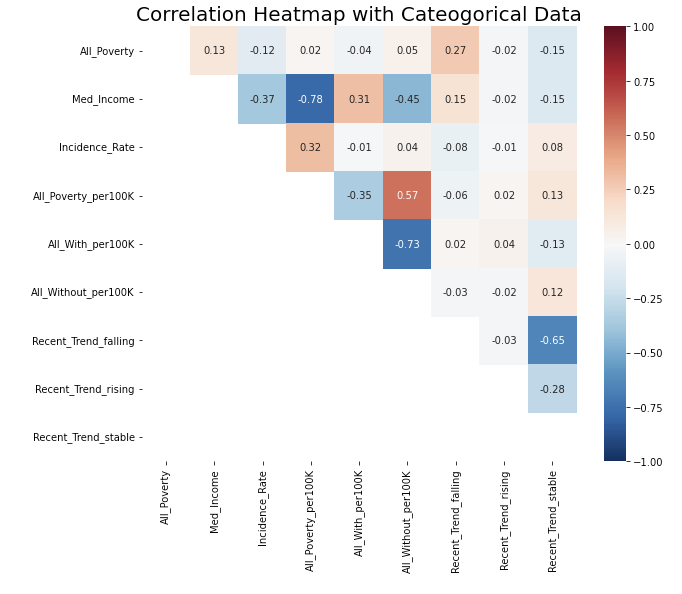
There is no strong correlation now.
Model Build-up
-
Split Data: 80.1% training set, 9.9 validation set, 10% test set
- Pipeline
- Feature pipeline: use pipeline to connect data preprocessing among different features
- Drop features
- Numerical features: simple impute to median (although we have done this by hand before)
- Special numerical feature: for the All-Poverty feature, I noticed it would be better to do a log transformation
- Categorical features: simple impute to most frequent value, and do one-hot encoding
- Model pipeline: After building up feature pipelines, I connected them to the model or algorithms, so I don’t need to do the same task again on test data set.
Model Selection
Linear Regression
- Simple Linear Regression
- Ridge Regression
- Lasso Regression
Among all linear regression, the simple linear regression has the best performance, while the other two have similar results in terms of MSE, MAE, and R-squared.
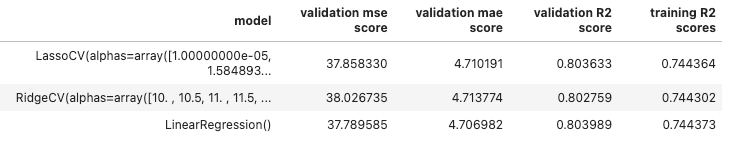
The reason is that I have already filter out other features, so the function of selecting features in Ridge and Lasso algorithms cannot perform well here. Also, the hyperparameter lambda in Ridge and Lasso regression will affect the key features a little bit, leading to slightly worse performance.
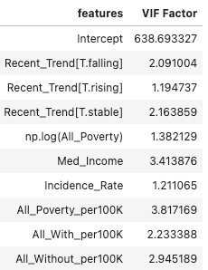
Check VIF (Variance Inflation Factor)
Larger values of VIF indicate multicollinearity. VIF values greater than 10 indicate that a predictor variable is to a large extent dependent on other predictor variables, and this can lead to unstable and misleading regression coefficients and inflated R-squared values
There is no multicollinearity in our feature set since all the VIF values are in the range 1-4, which is acceptably low. Hence, there is no need to refit the model.
In order to get a better sense of R squared value in presence of multicollinearity, you can use adjusted R squared metric that penalize presence of multicollinearity in the model. Since the VIF values here are in acceptable range, I am not performing this step as the high R squared is not due to presence of multicollinearity but indeed represents true explained variance
Non-linear Algorithms
- Random Forest
- XGB Regressor
Ensemble learning models such as Random Forest and XGBoost models can perform better since they are able to model complex non-linear relationships that regression models cannot.
Also, XGBoost can work with missing values in the data without the need for manual imputation. Since currently we have removed all the rows from the data where Mortality Rate is missing, using XGBoost can prove to be very useful here.
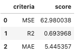
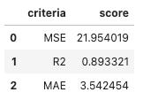
The performance of Random Forest v.s. XGBoost :
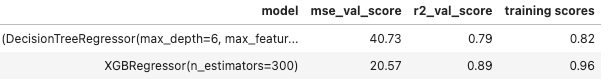
(P.S. The first row is random forest. & Parameters in both models have been tuned.)
So, I decide to use XGBoost as the final model.
Evaluation
- MSE
- R-squared
- MAE
Compare the best results from linear and non-linear regression:
Simple Linear Regression v.s. XGBoost Regression
XGBoost is still the best model so far for this problem.
Potential future improvement
- Semi-supervised learning: when imputing the missing value, doing semi-supervised learning may be helpful. It can prevent from losing information (remove missing value rows) and still relatively maintain the accuracy.
- Correctly tung hyperparameter: when tuning hyperparameter in XGBoost, I accidently guess the best parameters and did not put a wider range into searching CV loop. So, it is possible to have a higher score if I tune the hyperparameters correctly.
Takeaways
- Clean dirty and missing data from the scratch
- Use pipeline to connect every step from imputing to training models
- Tune hyperparameter
- Deploy Ridge, Lasso, Random Forest, and XGBoost algorithms for the first time
For code detail, you can check here.